
Excel Dashboard is a great way to make our raw data visually appealing. Imagine this: We have a long list of raw data, such as sales, expenses, website traffic, and employee performance. However, it doesn’t really help to look at hundreds of rows. A dashboard can help with that!
A one-page summary of our data with tables, charts, and visuals is called an Excel dashboard. Even if you’re new to Excel, do not worry as I will walk you through the process of creating an Excel dashboard in this tutorial.
Let’s begin! 🏁
🔍 What is an Excel Dashboard?
Think of Excel dashboards as a car dashboard. We can check car’s speed, fuel level, battery status, maps, music, lights status and much more. Similarly, Excel dashboard helps us in tracking metrics like sales,units sold, region wise numbers, employee wise cut etc.
Thus, a dashboard in Excel is a represents our data visually – it is same as the car dashboard, but for our business or project.
We can not scroll through hundreds of rows and columns. Instead we can:
-
📊 Prepare charts that can inform us about trends and outliers.
-
🔢 Highlight key numbers that matter for our business.
-
🎛 Apply filters to explore our data in an interactive manner.
🧰 What You’ll Need to Make Excel Dashboard
-
Microsoft Excel. Best to have the latest version. However, any version above 2016 will work.
-
A neat and organized data set (don’t worry, I’ll give you an example).
-
30-45 minutes to build the dashboard along with me.
📁 Step 1: Prepare Your Data for Excel Dashboard
In order for Excel dashboard to be effective, we must clean our data first. So start by cleaning and organizing it.
Let’s take the example of an online store. Assume that we run it and track daily sales. Here is the raw data, download it and follow along – Excel_Dashboard_30_Rows
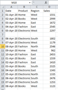
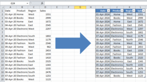
We can notice that it looks messy. It is not formatted, not aligned, there are blank rows too. Let’s organize it and transform it like this –
Important tips:
-
We have provided each column a clear heading
-
Deleted merged cells and blank rows
-
We also converted the range to an Excel Table by selecting the data, then going to ‘Format as Table’ and chose the table style. This helps in updating and filtering easily.
- Now create a new tab, name it ‘Summary’ and apply a light pastel color.
📊 Step 2: Create Pivot Tables to Summarize Data
It is time to create summaries using Pivot Tables – a powerful feature in Excel that enables us to slice and dice our data easily. If you do not know how to create a pivot table, check out our in depth article on pivot tables – Pivot Table: Step-by-Step Guide for Beginners
✅ Example: Total Sales by Region
-
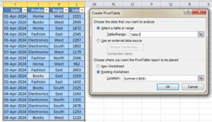
Go to the salesdata tab. Select the raw data table. Click anywhere inside the Excel Table
-
Then go to Insert > PivotTable
-
Then, place the Pivot Table in the summary tab and click ok
-
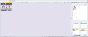
Go to the summary tab now. We will find our blank pivot table there. Now in the pivot table Fields pane:
-
Drag Region to Rows
-
Drag Sales to Values
-
🎉 Hence, we now have a table showing total sales by region! We can apply formatting of our choice.
✅ More Summaries We Can Create:
-
Sales by Product Category
-
Sales by Date
-
Monthly or Weekly Trends
We can practice more by creating a few Pivot Tables like these in the same summary tab.
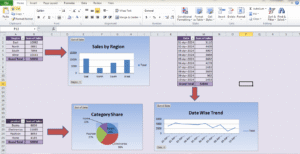
📈 Step 3: Turn Your Data Into Charts
Now that we have built additional pivot tables, let’s make them visual by pivot charts. If you do not know how to create one, check out this article – Excel Charts and Data Visualization – A Complete Guide
Example: Create a Column Chart for Sales by Region
-
First click inside the Pivot Table (e.g., Sales by Region)
-
Then go to Insert > Column Chart > Clustered Column
-
You’ll see a basic bar chart appear
-
Then just click on the chart title and rename it to “Sales by Region”. We can apply formatting of our choice.
Repeat this for other Pivot Tables:
-
Line chart for sales over time
-
Pie chart for category share
-
Similarly, Bar chart for displaying sales by regions
Customize your charts:
-
We can use bold and clear titles
-
It is must to remove clutter like gridlines if it is not necessary
-
Apply colors that match the theme of our brand (or keep it clean and simple)
🎛 Step 4: Add Slicers to Filter Your Excel Dashboard
A great way to make our dashboard interactive is to add slicers!
With Slicers, we can filter multiple charts at once – for example, we can view only “Electronics” or only “West” region.
Example: Add a Region Slicer
-
First Click on a Pivot Table
-
Then go to PivotTable Analyze > Insert Slicer
-
Then select Region
-
This will open a slicer box – we need to move it to our Dashboard
-
Finally we need to select a region in the slicer – all charts linked to that Pivot Table will auto update
To connect slicers to other charts:
-
First click on the slicer
-
Then go to Slicer > Report Connections
-
Finally, tick all the Pivot Tables we want to control with this slicer
Now our dashboard is dynamic!
✨ Final Touches: Polish Your Excel Dashboard
-
Align your charts – make sure the keep the spacing consistent between tables and charts
-
Use colors wisely – use pastel and light colors to keep the professional look.
-
Highlight key insights – use big fonts for numbers like “Total Sales: ₹5,70,000”
-
Remove unnecessary gridlines, labels, or chart junk
📌 Summary: What We’ve Learned on Excel Dashboard
Let us quickly recap of how to build a Excel dashboard:
-
First organize our data in a clean Excel Table. Deploy alignment, remove blank rows, use table format
-
Create Pivot Tables to summarize key info
-
Then create beautiful charts from those summaries
-
Now arrange the visuals evenly in a separate Dashboard sheet
-
Then add slicers for interactivity
-
At last, polish the layout for a clean, professional look
🧠 Bonus Tip: Make Your Excel Dashboard Auto-Updating
As a good practice, whenever we add new data to our table:
-
We should go to each Pivot Table and click Refresh
-
Charts and slicers will automatically update too
🗂 Additional Questions on Creating Excel Dashboard
The Excel_Dashboard_30_Rows we used for this article has the sample dashboard we created.
Additionally, use this Excel – sales_dashboard_practice for practicing the below questions –
Suppose that you are working for a company called “Global Sales Inc.” They sell products across 4 regions: North, South, East, and West.
Now your task is to create a Sales Performance Dashboard that includes:
-
Total Sales (Dynamic based on Region/Month selection)
-
Sales by Product Category (Pie Chart)
-
Monthly Sales Trend (Line Chart)
-
Top 5 Products by Sales (Bar Chart)
-
Region-wise Sales (Map Chart if possible, or Column Chart)
-
Then filter by:
-
Year (Dropdown filter)
-
Region (Dropdown filter)
-
👉 Bonus challenge: Add conditional formatting to highlight months where sales dropped compared to previous months.
Let us know in comments if you are stuck at any question and we will help you.
Conclusion
You will improve your abilities in data visualization, pivot tables, and dynamic filtering by finishing this dashboard project. These are all essential skills for creating expert Excel dashboards. In addition to honing your technical skills, practicing with real-world data and tasks will help you develop your business analysis mindset. Continue experimenting with various chart types, layouts, and interactive elements to create dashboards that are both aesthetically pleasing and informative. This kind of regular practice will help you get ready for actual work assignments and freelance opportunities. All the best!
Additionally, for more advanced excel dashboards, please check the Official Microsoft Guide
Also check out our other articles on –
Very good.
Very good.
Very good.
Good.
Good.
Very good.
Very good.
Good.
Awesome.
Very good.
Awesome.
Awesome.
Awesome.
Very good.
Good.
Very good https://is.gd/N1ikS2
Awesome.