
Excel is a very powerful tool for data visualization. It is not just about numbers and data entry. Hence, Excel charts are quite popular for their ability to visually represent the data. We have Waterfall, Pareto, and Funnel charts in Excel that really stand out for tasks like analyzing revenue, identifying key contributors to a problem, or tracking user drop-off in a sales funnel.
In this post, we will discuss the following –
-
What is the use of each chart type
-
How to create these charts in Excel step-by-step
-
Practical examples and
-
Practice questions
1. Waterfall Chart in Excel
What is a Waterfall Chart?
Waterfall Charts are great for tasks like financial analysis, profit and loss visualization etc where we need to show how revenue is calculated after taking into account expenses.
Example Scenario:
Let’s take the case of a company with $10,00,000/- in revenue. Then we have expenses like rent, salaries and taxes. Hence, we need to display how we arrive at net profit by deducting expenses from the revenue.
Steps to Create a Waterfall Chart:
-
First, prepare the data in this format:
| Category | Amount |
|---|---|
| Starting Revenue | 10,00,000 |
| Rent | -2,00,000 |
| Salaries | -4,00,000 |
| Taxes | -1,00,000 |
| Net Profit | 3,00,000 |
-
Now select this table.
-
Then go to Insert > Insert Waterfall or Stock Chart > Waterfall.
-
Excel will create the waterfall chart like this –
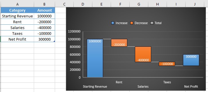
We can show the final value as a total. Just double-click the bar → right-click → select Set as Total.
Pro Tip:
We can customize colors (e.g., green for gains, red for losses), text format etc for making the chart look more professional.
2. Pareto Chart in Excel
What is a Pareto Chart?
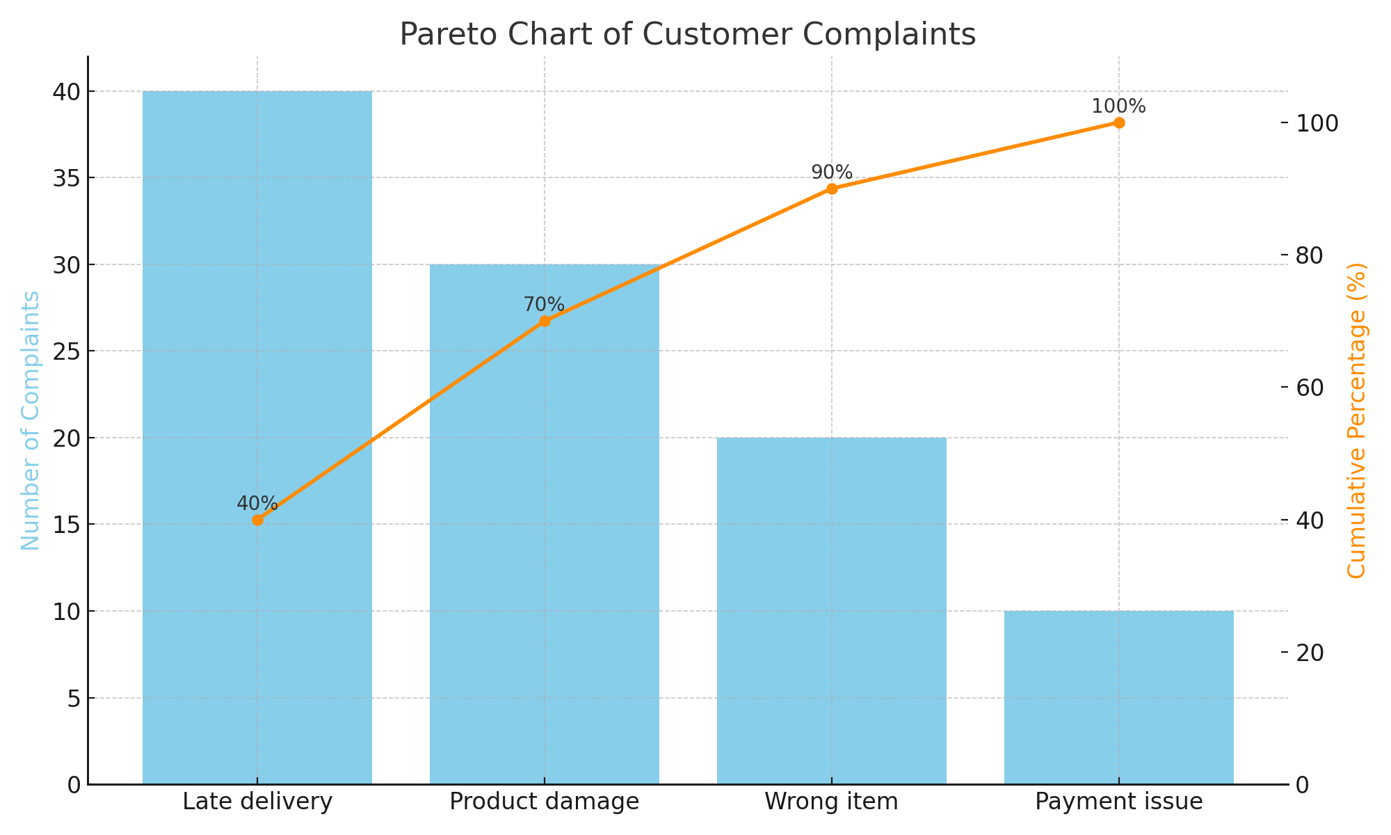
Pareto Charts are used for showing the 80/20 rule, i.e., 80% of the problems are caused by 20% issues. Here we combine bar chart with line graph and display issues in descending order.
Example Scenario:
Imagine we handle customer complaints and want to display the 3 main causes that are responsible for most of the issues.
| Issue Type | Complaints |
|---|---|
| Late delivery | 40 |
| Product damage | 30 |
| Wrong item | 20 |
| Payment issue | 10 |
Steps to Create a Pareto Chart:
-
First arrange data from highest to lowest like in the above table.
-
Select the table.
-
Then go to Insert > Insert Statistic Chart > Pareto.
-
Excel will create the chart with bars and a line.
-
Customize axis and labels as per the requirement.
Tip:
Use Data Labels to show exact values or percentages directly on the chart.
3. Funnel Chart in Excel
What is a Funnel Chart?
As the name suggests, a Funnel Chart is used to showcase funnels. For e.g., 100 people saw the product, 20 clicked on it, 5 added it to the cart and 2 completed the purchase. Hence, Funnel Chart is ideal for sales pipelines, lead drop-offs, or process flows.
Example Scenario:
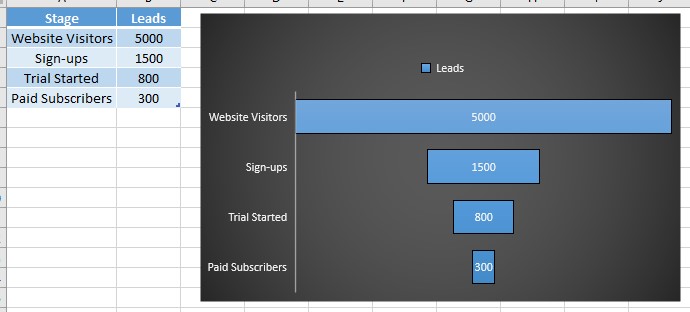
Consider this digital marketing funnel:
| Stage | Leads |
|---|---|
| Website Visitors | 5000 |
| Sign-ups | 1500 |
| Trial Started | 800 |
| Paid Subscribers | 300 |
Steps to Create a Funnel Chart:
-
Prepare the data as shown above.
-
Select the data.
-
Go to Insert > Insert Waterfall or Stock Chart > Funnel.
-
Excel will instantly creates the funnel chart.
Bonus:
Format the bars with gradient fills or color codes to visualize drop-off stages. Just click on the bars and apply the colors for this.
Comparison Table of Waterfall, Pareto and Funnel Charts
| Chart Type | Best Use Case | Chart Type in Excel |
|---|---|---|
| Waterfall | Financial breakdowns | Waterfall Chart |
| Pareto | Problem analysis (80/20 rule) | Pareto Chart |
| Funnel | Sales or process funnel analysis | Funnel Chart |
Practice Questions on Waterfall, Pareto and Funnel Charts
it is time to try these in Excel own your own –
Waterfall Practice:
-
Make a Waterfall chart for total budget ($50,000) and display how it gets spent across expenses like rent (5,000), transport (3000), food (2000), and entertainment (1500).
-
Highlight the final balance in a different color.
Pareto Practice:
-
List out top 5 reasons due to which customers are returning products and also map the return frequencies of respective reasons.
-
Create a Pareto chart and identify top 2 contributors.
Funnel Practice:
-
Similar to the example given above, create your sales funnel starting from ad impressions till closed deals.
-
Add Data Labels to show percentages.
Tips for Making Better Waterfall, Pareto and Funnel Charts
-
It is explicitly important to sort your data in descending order for Pareto and Funnel charts.
-
Secondly, make use of colors and labels for making the charts visually appealing.
-
Occasionally, mention titles and axis labels for more clarity.
-
Lastly, keep the chart free of clutter – clean visuals are always more impactful.
With these good practices, our Waterfall, Pareto and Funnel Charts can become significantly more professional looking.
Conclusion on Waterfall, Pareto and Funnel Charts
Evidently, your ability to convey data insights can be substantially improved by comprehending and utilizing Waterfall, Pareto, and Funnel charts in Excel. For business stakeholders in particular, these charts simplify complex data.
Try them out in real-world situations, such as lead tracking, budgeting, or root cause analysis. Additionally, keep in mind that your data storytelling improves as you experiment with Excel’s charting features.
Also check out our other articles on –
Gantt Charts in Excel: Step‑by‑Step Tutorial + Free Template 
How to Use Flash Fill in Excel: Save Time on Data Entry
1 thought on “Waterfall, Pareto, and Funnel Charts in Excel: A Beginner’s Guide”