
Excel Charts are extremely helpful for data visualization. They are a must for every employee to learn. It is much easier to tell a story with charts and graphs than via tables and paragraphs.
At first thought, the name of Excel may immediately evoke in our mind images of endless rows and columns of data. However, the secret is that Excel is much more than just a spreadsheet. The ability to use charts to visualize data is one of its most potent features. Charts can transform boring looking data into visually appealing and easily comprehensible information, whether we are tracking monthly expenses, analyzing sales, or presenting survey results.
We have prepared this comprehensive beginner’s guide which will walk you through:
- The definition of charts and their significance
- Excel’s most popular chart types
- Detailed instructions for making them
- Advice for personalizing your charts
- Examples from the real world that we can use to practice
Let’s get started!
Why to Use Excel Charts?
Let’s first examine the significance of data visualization before moving on to chart types.
📌 Consider this: You are presenting to your manager monthly sales data. Would you prefer to display:
- 50 rows of numbers in a table, or
- A monthly trend displayed in a vibrant bar chart?
The chart clearly prevails. It conveys insights immediately.
Charts assist us in:
- Identifying patterns and trends fast.
- Emphasizing any anomalies or abrupt changes.
- Making decisions based on data.
- Giving others clear information.
Getting Started: How to Insert a Excel Charts
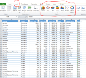
It is very easy to create a chart in Excel. Many think it is a complicated process but it is surprisingly easy. We will use this Excel sheet to practice – Financial Sample
Step-by-step:
-
First, open your Excel sheet.
-
Then, select the data range (including labels).
-
Then, click on the
Inserttab in the ribbon. -
Now we need to choose the chart type we want (like Column, Line, Pie, etc.).
-
Excel will instantly create the chart on our sheet.
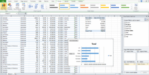
1. Column Excel Charts – Best for Comparing Values
Column charts are the most basic chart types. They are extremely powerful for displaying a table as a chart. Column charts make it easy to identify trends and outliers. They are also known as bar charts when we create them horizontally.
Example:
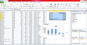
Open the excel sheet we provided above. Let’s say we’re tracking Gross Sale country wise. This is how we can create a pivot table and Excel chart for this –
- Select the entire data
- Create a pivot table. If you don’t know how to create one, check this article – Pivot Table: Step-by-Step Guide for Beginners
- Select the pivot table and create a chart by following the steps mentioned above. We need to select column as chart type.
This is how it will look.
Tips:
-
It is better to use column charts when we have only a few categories.
-
These charts are excellent for visualizing comparisons side-by-side.
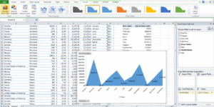
2. Line Excel Charts – Ideal for Trends Over Time
When you want to demonstrate how something changes over time, such as monthly revenue, website traffic, or temperature, line Excel charts are excellent.
Example:
We need to analyze how sales increases or decreases month wise. We will follow the same steps as above and select line chart. The output will be like this –
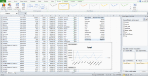
Here we inserted a Line Chart and Excel drew a line connecting the data points.
Tips:
-
Line charts are best to use when our data is sequential (like time-based).
-
These are great for showing progress, growth, or declines.
3. Pie Excel Charts – Best for Showing Proportions
Pie charts are excellent for showing how a whole is divided into parts. In the form of a pie, each slice will represent a percentage of the total.
Example:
Let’s say our boss wants to see how which product is selling more compared to others. The boss wants to see the % breakup of all sales products wise to visualize. We will again follow the same steps, output will be like this –
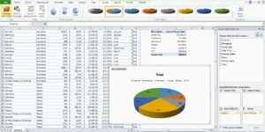
We just inserted a Pie Chart, and as expected, every slice is showing the % contribution of every product to total sales.
Tips:
-
Pie charts are best used when showing parts of a whole.
-
Try to keep it simple by avoiding too many categories.
4. Bar Excel Charts – Like Column Charts, But Horizontal
Bar charts are nothing but the inverted version of column charts. Here the bars go left to right instead of bottom to top. Bar charts are relatively easier to read if category names are long.
Example:
We will do the same analysis from the above example (product wise sale) via bar chart. Here is the output –
A bar chart makes this clear at a glance.
5. Area Excel Charts – Add Visual Impact to Trends
Area charts are nothing but another version of line charts. The only difference is that the space under the line is filled with color. When you wish to draw attention to the volume beneath a trend, they can be helpful.
Example:
Let’s create an area chart for the line chart problem statement, i.e., showing gross sale month wise. Here is the output –
We can use an Area Chart if we want to make it visually appealing and dramatic.
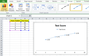
6. Scatter Plots – Great for Correlation
Scatter plots are used to show relationships between two variables. Here, each point is representing one observation.
Example:
We want to understand if we will get more / less marks in test if we change our study hours.
| Hours Studied | Test Score |
|---|---|
| 2 | 60 |
| 4 | 75 |
| 6 | 85 |
| 8 | 95 |
Using the same steps provided above, we inserted a Scatter Plot, and now let’s look for a trend – like a line moving upward or downward. That’s the correlation we are looking for.
Output will be like this –
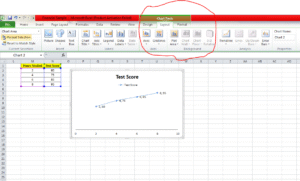
Excel Charts Customization: Make It Yours
After we are done with creating a chart, Excel will let us do hundreds of customization in the chart. Let’s understand a few basic ones.
A. Change Chart Title
We can click on the chart title and then type our own chart title (e.g., “Monthly Sales Data”).
B. Add Data Labels
We can also click on the chart > Chart Elements (+ symbol) > then check Data Labels. This will show us values on the chart itself.
C. Switch Row/Column
if the chart looks like it needs rotation, we can try this to change the appearance. We need to go to: Chart Tools > Design > Switch Row/Column
D. Change Colors and Styles
We can choose from predefined styles inbuilt in Excel. If we do not like the predefined styles, we can even pick our own colors to match the theme of our presentation.
Bonus: Combo Excel Charts (Bar + Line Together)
The chart types we discussed so far are the most frequently used ones. Excel, however, has many more chart types available for specific requirements. For e.g. we have –
-
Stock Chart: Perfect for displaying financial data, such as open, high, low, and close values of stock prices. For time-series financial analysis, it works best.
-
Surface Chart: Like a topographic map, a surface chart uses three-dimensional data to illustrate the connections between sizable data sets. Excellent for determining which two-variable combinations produce the best results.
-
Doughnut Chart: When comparing multiple data series, the doughnut chart, which resembles a pie chart but has a hole in the middle, makes it easier to read. helpful for displaying percentages and proportions in a small, fashionable format.
Excel also allows us to create Combo Charts, where we can combine two chart types which is excellent for displaying different types of data on the same chart.
Example:
| Month | Revenue | Profit Margin (%) |
|---|---|---|
| Jan | 10000 | 20 |
| Feb | 12000 | 25 |
| Mar | 9000 | 18 |
-
We can use a column chart for Revenue.
-
And we can insert a line chart for Profit Margin.
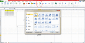
We can find additional chart types here in the highlighted part –
Real-Life Scenarios Where Excel Charts Help
- Sales Reports: Monitor sales results by area or sales representative
- Budgeting: Show how much you spend each month.
- Surveys: Use pie charts to display response rates.
- School Projects: Make data entertaining and simple to comprehend
Best Practices for Better Excel Charts
- Avoid cluttering: Limit each chart to one or two important points.
- Label everything: Data labels, axes, and titles are helpful.
- Select the appropriate chart type: If a bar chart would be more appropriate, don’t force a line chart.
- Make meaningful use of color: Don’t use every hue in the rainbow. Limit yourself to two or three complementary tones.
- Describe a story: “What is this chart trying to say?” ask yourself.
Wrap-Up
Excel charts are used to make data speak, not just to make things look nice. What’s the best part? Making them doesn’t require you to be a data scientist. You can hence transform your tables into eye-catching visual masterpieces that make insights pop off the screen with a few clicks.
Thus, open Excel and give it a try!
Please feel free to bookmark this page or forward it to a friend who is learning Excel if you found it useful. Please let me know in the comments if you would like to see more tutorials like this one. 😊
If you want to learn how to create these charts using AI, head over to this article – Create Excel Charts with CoPilot.
Also check out our other articles on –
Good.
Awesome.
Good.
Awesome.
Good.