While managing a project, Gantt Chart in Excel is an excellent way to map out who is doing what and when. That is why project managers love it. While there are more sophisticated tools like Microsoft Project or Asana for this, Gantt Chart in Excel is easy and quick to use. We can create a professional looking, fully loaded Gantt chart in less than 15 minutes. Best part is, we can reuse these charts as much as we want.
In this guide, we will explore –
-
What is a Gantt chart
-
Two ways to build one in Excel
-
How to customize, troubleshoot, and automate common tweaks (milestones, percent‑complete bars, critical path colours)
-
Practice exercises
-
A ready‑made template
Download this gantt_template. Download this Excel sheet as we will discuss the examples from it.
1. What Is a Gantt Chart in Excel?
Gantt chart was invented by Henry Gantt in 19th century. It is basically a bar graph that shows timelines. For e.g., if a project has multiple tasks having different start dates, duration and ordering, Gantt chart can map this in a visually appealing manner.
Modern versions of Gantt charts are also capable of adding features like status shading or milestone diamonds. These added features can convert a static plan into a live tracker which can be updated in real time.
2. Prerequisites of Making Gantt Chart in Excel
-
We need Excel 2016 or later versions.
-
The user should have comfort with basic tables, formulas and formatting
-
A handy list of tasks with start & end dates
Now let’s look at how to make a Gantt chart.
3. Method 1 – Build a Classic Gantt Chart in Excel from Scratch
Tip: If you have not downloaded the Excel sheet provided above, please do it now.
Step 1 – Organize Your Task Table
This is the table we have in the Excel –
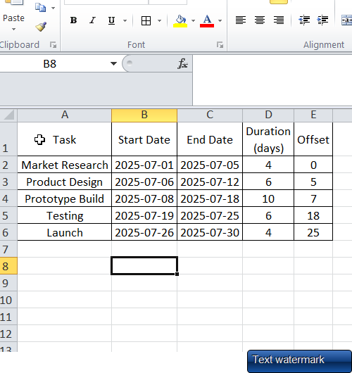
In D and E column, we have applied following formulas to get the task duration and offset date –
| A | B | C | D | E |
|---|---|---|---|---|
| Task | Start Date | End Date | Duration | Offset |
| Market Research | 1‑Jul‑25 | 5‑Jul‑25 | =C2‑B2 |
=B2‑MIN($B$2:$B$6) |
-
Duration gives the bar length.
-
Offset tells the Excel where to start the respective bar on horizontal axis. This is required as Excel does not comprehend the start date directly.
Step 2 – Insert a Stacked Bar Chart
-
Start by selecting the Duration and Offset columns.
-
Then go to Insert ➜ Bar Chart ➜ Stacked Bar.
Thus, Excel will draw two bars per task – an “invisible” offset bar and the visible duration bar.
Step 3 – Reverse Task Order
Having the task 1 on top is easier to read. We can do that by –
-
Right‑clicking the vertical axis → Format Axis ➜ Categories in reverse order.
Step 4 – Hide the Offset Series
This is required to hide the offset bars. We need to –
-
Click the leftmost (Offset) bars.
-
Then go to Format Data Series ➜ Fill ➜ No fill; Border ➜ No line.
Thus, the visible bars now begin at the real start dates.
Step 5 – Make the X‑Axis Show Days (or Weeks)
-
Right‑click horizontal axis → Format Axis
-
Minimum: set to your project’s start date
-
Major unit: 1 day, 7 days, or custom
-
Tick Date axis (older versions list it under Axis type)
-
Step 6 – Cosmetic Polish
This is an optional step but can go a long way in improving the readability of your chart.
-
Colours: one colour per phase or status (e.g., green = completed).
-
Data labels: add Task Name or % Complete right‑inside bar ends.
-
Gridlines: Furthermore, light grey vertical lines every week improve readability.
Time‑Saver: our template already has these settings. Thus, just overwrite the task table and watch the chart refresh.
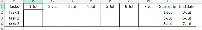
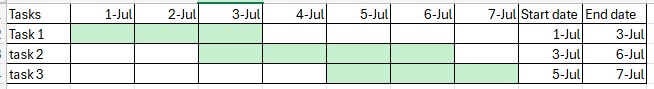
4. Method 2 – Quick Heat‑Map Gantt (Conditional Formatting)
This method is even simpler. Just follow along –
-
Firstly, prepare your data in this format –
- Now select cells B2 to H4. Then go to Conditional Formatting ➜ New Rule ➜ Use formula. Write this formula “=AND(B$1>=$I2, B$1<=$J2)”, select the required color and hit done.
- TRUE cells light up, thus giving a heat‑map timeline.
You may also re-use the Gantt chart provided in our Excel sheet and just update the values and colors to customize it as per your need.
5. Practice Questions
-
Marketing Launch: Make a Gantt chart in Excel for a project having these 5 tasks – Research, Content, Design, Ads, Review. Duration is between 1st Aug 2025 till 31st Aug 2025.
-
Event Schedule: Additionally, prepare a timeline for a one‑day conference having these sessions – Registration, Keynote, 3 Sessions, Networking. Allocate 30 minutes to every session.
Drop your queries in comments if you are stuck anywhere.
6. Wrapping Up
To summarize, we discussed two methods of making Gantt charts and also provided a reusable template. With this, we can visualize any project timeline in Excel. It may be a product launch, a wedding, or your study schedule. If you prepare the chart well, you can clarify priorities, highlight bottlenecks and keep everyone updated on deadlines.
Please feel free to try out added features like slicers and pivot link costs etc. As long as you retain the Offset + Duration logic, Excel will happily scale from five to fifty tasks.
Happy planning, and see you in the next tutorial!
Also check out our other articles on –
1 thought on “Gantt Charts in Excel: Step‑by‑Step Tutorial + Free Template 📊”