
Static dashboards in Excel have limited capabilities. A good dashboard should be able to refresh itself with one click whenever there is a change in raw data. It should also be user friendly so that other people too can operate it. That is why we should build interactive excel dashboard using slicers.
In this guide, we will walk you through the entire process, from cleaning the raw data to using slicers in the final dashboard. Please download this Excel as we will use this to discuss further Orders_Dataset_Example
1. Benefits of an Interactive Dashboard in Excel using Slicers?
-
Single‑screen summary: We can display key metrics, charts and tables in a single sheet.
-
Responsive controls: We can provide user friendly features like drop‑downs, buttons, or slicers to instantly adjust visuals.
-
User‑proof: End‑users don’t have to touch raw data or formulas. All they need to do is use slicers for getting the required view.
Such interactive dashboard in Excel using Slicers can be compared to a lightweight BI app – built right in Excel.
2. Clean the Raw Data (5-10 mins)
- After downloading the file from the link above, check that dates, numbers and text are in the correct format. Modify wherever required.
-
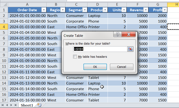
Once done, hit (
Ctrl + T) to convert the data to a table and give the name ‘Orders’ to this table. Tables auto‑expand, and are easy to work with PivotTables. -
Check for tidy columns: Ensure that every column has a header and there are no merged cells. Also create a new tab for building summary.
Example dataset from the sheet provided above has following columns: Date, Region, Segment, Product, Units, Revenue, Profit.
3. Build a Core PivotTable (5 mins)
-
Start by building a pivot table summary. Go to Insert ► PivotTable ► From Table/Range → place it on a new sheet.
-
Drag Region to Filters, Product to Rows, Revenue and Profit to Values.
4. Visualize with PivotCharts (5 mins)
-
Firest select the PivotTable. Then got to Insert ► PivotChart ► Clustered Column.
- Place the chart next to the Pivot table.
5. Add Slicers (3 mins)
-
Go to Insert, then hit Slicers.
-
Tick Region and Product; click OK.
-
Format slicers: you can adjust the look and feel of slicers by right clicking on Slicers and then adjusting the settings.
Hence, final dashboard will look like this –
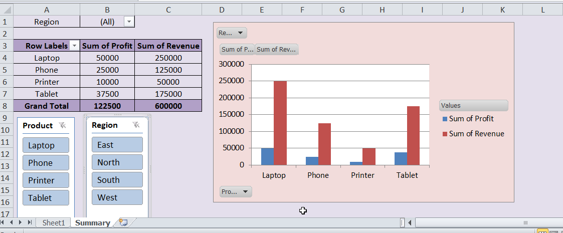
Evidently, adding slicers gives great convenience to other users. For e.g., if we hit East in region slicer, Pivot table and chart show the data for East only. Similarly, we can filter product wise too with just one click.
6. Conclusion
Interactive dashboards make Excel fun and user friendly. Additionally, introducing slicers make the dashboards polished and neat looking. Best part is, you can do it without writing VBA code or macros and in minutes.
Also checkout our other articles on –
2 thoughts on “How to Create Interactive Dashboards in Excel Using Slicers”